![‘Predator: Killer of Killers’ Directors on the Anthology Format and Historical Accuracy [Interview]](https://i0.wp.com/bloody-disgusting.com/wp-content/uploads/2025/06/Screenshot-2025-05-19-121021-1.jpg?fit=1694%2C802&ssl=1)
![Vampiro Returns — To Build a Cult on the Airwaves [Podcast]](https://bloody-disgusting.com/wp-content/uploads/2025/06/vAMPIRO-bANNER-TEMP-1024x576.png)


![Metaphysical Pop [THE MUSIC OF CHANCE]](https://jonathanrosenbaum.net/wp-content/uploads/2011/05/the-music-of-chance-patinkin-kid-1.jpeg)


![‘I Don’t Understand You’ Directors Brian Crano & David Joseph Craig On Working With Nick Kroll, Andrew Rannells & Making A Vacation Horror Comedy [Interview]](https://cdn.theplaylist.net/wp-content/uploads/2025/06/06125409/2.jpg)


![United Quietly Revives Solo Flyer Surcharge—Pay More If You Travel Alone [Roundup]](https://viewfromthewing.com/wp-content/uploads/2025/04/united-737-max-9.jpg?#)


Posterized June 2025: Afternoons of Solitude, 7 Walks with Mark Brown, Dangerous Animals & More
This could be a big month at the box office. John Wick spinoff Ballerina hits the 6th. The live-action How to Train Your Dragon opens the 13th. Pixar’s Elio and Danny Boyle & Alex Garland’s 28 Years Later arrives the 20th. And M3gan 2.0 releases the 27th. Add the potential of F1 landing big on […] The post Posterized June 2025: Afternoons of Solitude, 7 Walks with Mark Brown, Dangerous Animals & More first appeared on The Film Stage.

This could be a big month at the box office. John Wick spinoff Ballerina hits the 6th. The live-action How to Train Your Dragon opens the 13th. Pixar’s Elio and Danny Boyle & Alex Garland’s 28 Years Later arrives the 20th. And M3gan 2.0 releases the 27th. Add the potential of F1 landing big on the 27th and your entire month is set.
While there might be fewer screens available for everything else as a result, cinephiles seeking the road less traveled could find themselves with a reprieve from the phone lights and chatter of casual theatergoers flocking to those big-name titles. And if one of these posters happens to hit the eye of a tent-pole seeker just right, they could also find themselves stumbling into something new.
That’s the beauty of a good one-sheet: letting the converted know what else is playing and supplying a dose of intrigue capable of converting a few more.
Genre fare


Everybody wants to believe that Tom Cruise is the “last movie star,” but I received a press email about Diablo (limited, June 13) that didn’t even care about providing the title. All it said in the subject was: Scott Adkins New Film! And I guarantee that’s all most of the people responding about coverage opportunities needed to hear.
So it’s nice to see Fable giving the action star a compelling piece of artwork to go with his brand appeal. It’s not just Adkins holding a gun to the camera lens with glossy photography showing a night scene in the rain (or some similar overwrought cliché). It’s an expertly composed Dutch angle of him and Marko Zaror filtered to the point of illustration and stripped down to a duotone of red and black instead. There’s artistry. Drama. Determined looks of cold-blooded, violent intent. You’re ready to spin this thing around and get in on the fun.
The same can be said for Escape from the 21st Century (limited, June 9). Rather than stick to a boring still, the designers lean into the film’s hyper-kinetic visual style to manufacture that same breakneck speed via a static image. It’s as though the three actors are running through a digital display of LED lights flickering and blurring as colors merge. And the parallel of their younger selves at the top drives home the duality on display: their past consciousnesses inhabiting future bodies.
I love the title block, too, with its shaky comic, drop-shadowed flavor and the elongation of the “E” to mimic the left-to-right motion permeating the entire piece. And while the inclusion of the dandelion about to seed might not hit fully if you haven’t yet seen the film (the boys time-travel by sneezing), its line-drawing aesthetic lends it the look of an analog clock while its portrayal of that phase doubles as a timer ticking to zero.
While clean cool and digitized fun do their genre work justice, however, there’s nothing like a bit of pulpy carnage à la GrandSon’s Dangerous Animals (June 6). That it’s delivered with a minimalist sensibility only ramps up the excitement––it lets us imagine what’s in store rather than bludgeon us with it.
And why not? The most famous shark film is Jaws, and Seiniger Advertising’s iconic use of Roger Kastel’s illustration presented the danger as a suspense-fueled foregone conclusion. So how do you deliver that same sense of terror with a more modern, perhaps unhinged, approach?
You allude to the shark via a boat’s bloody wake in the shape of a dorsal fin. You let that vehicle (and the serial killer aboard it) become the monster rather than the animal––a point driven home by the tagline, “You’re safer in the water.” And you utilize a bright red for the text that clashes so strongly with the blue of the water that it can prove impossible to read in its creation of an optical strobe effect that burns a “danger” light into your retinas.
In the spotlight


For a more dramatic flavor, the following three designs strip back everything to place their star front and center. Through the shadows, in the light, and… when they least expect it.
Le Cercle Noir goes full chiaroscuro with Matthias Clamer’s photograph of Noémie Merlant on the sheet for Emmanuelle (VOD, June 6). The high-contrast shadow work gets bumped up to 100% so the dress and background can merge into a vacuum void that renders the actor’s skin the sole sliver of light down the middle.
It’s simple and seductive but, most importantly, mysterious. And it ensures the performance becomes synonymous with the title, stripping away the history of the property’s other adaptations to center this one as its own beast. The only call back to InSync Plus’s poster for the original film is the blackness. Where that merely teased sex, this teases power.
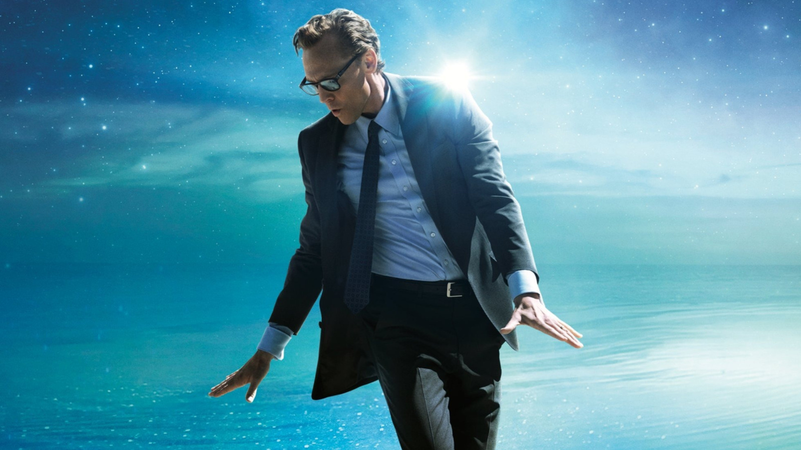
Bangers & Mash conversely tease fantasy and hope with their poster for The Life of Chuck (limited, June 6; wide, June 13). They showcase Tom Hiddleston mid-dance amidst a cosmic dreamscape of his own mind. It simultaneously depicts the joy of life and uncertainty of reality––the place itself causes us to wonder about its creation.
Is this environment just a flight of fancy or a coping mechanism? Has he embraced the magic of his life to see the infinite wonders within, or has he been pushed to retreat into his imagination as a means for survival? We want to believe the former because it lends the whole a sweet sense of optimism, yet the intentional lack of context it’s difficult not to brace for the latter. That’s not to say it isn’t still hopeful, though. There are plenty of tragedies built to inspire through authentic pain.
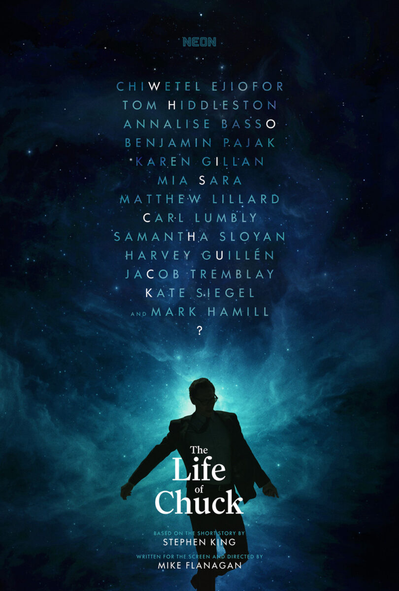
I’ve really enjoyed Neon’s campaign for this film––it’s refused to give too much. Between this one and AV Print’s original tease (using the cast’s names to ask the question: Who is Chuck?), the vagueness becomes the point. Eventually we start hypothesizing whether this character is even human.
Yet, despite an obvious crudeness compared to those glossy photo manipulations, Found Footage: The Making of the Patterson Project (limited, June 20) is the poster that sticks with me most from this trio. That it succeeds so well despite the reality that its faux-grunge style and typography could use some polishing only proves the greatness of its concept. It’s why I wish more firms would swing for the fences. Execution can be excused when the idea is too good to ignore.
It mines down to the essence of this film about documentarians chronicling a director’s attempt to make the best found-footage horror ever by lifting the curtain to show the artifice of production. Here is a man in a monster suit whose image is captured by outsiders who are then able to reappropriate the context of said image for their own purposes. It starts as a simple behind-the-scenes still of craft, yet the timing of the shot and positioning of the frame also render it a comical homage to Sasquatch sightings.
Reality is thus not to be trusted because it can (and will) always be manipulated by whoever curates it to the masses. This is a found-footage account of a found-footage film––the layers of its deception folding in on itself until you’re forced to question whether anything was real at all.
Boxed-in


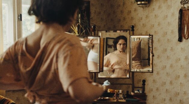
I’ve been a fan of Paul Wilson and yellow1’s poster for The Queen of My Dreams (limited, June 20) ever since it started popping up around the film’s TIFF premiere. It’s aesthetically pleasing with gorgeous font selections (the title’s ornateness against the cast and director names in a striking sans serif), but also thematically sound: the wallpapered grid of old posters like those of the Bollywood films connect mother and daughter through imaginative fantasy.
I am torn, however, when Wilson has been very transparent about his use of AI to create it. On one hand, it’s easy to simply dismiss it sight-unseen as a result. The other hand begs for nuance. We’ve become so quick to use the term “AI” as a synonym of generative AI that other forms (e.g. machine learning) have been lumped in, causing unwarranted uproars like those surrounding The Brutalist last year.
Still: my assumption is that the AI used was of the generative variety. That Wilson probably had a computer manufacture those posters for him to use in the background. Whether that means the images themselves to then piece together and add ripples and rips, or that AI generated the entire backdrop to place Amrit Kaur upon––I don’t know. Neither is ideal, and neither negates the fact that Wilson also built the finished piece.
Unfortunately, we cannot help ourselves from assuming each of those posters plagiarized another artist’s work. So you must ask if there was a way to source real posters for use instead. Yes, I’m just speculating here, but Wilson’s use of the word “heavily” when referencing his AI use forces me to do so.
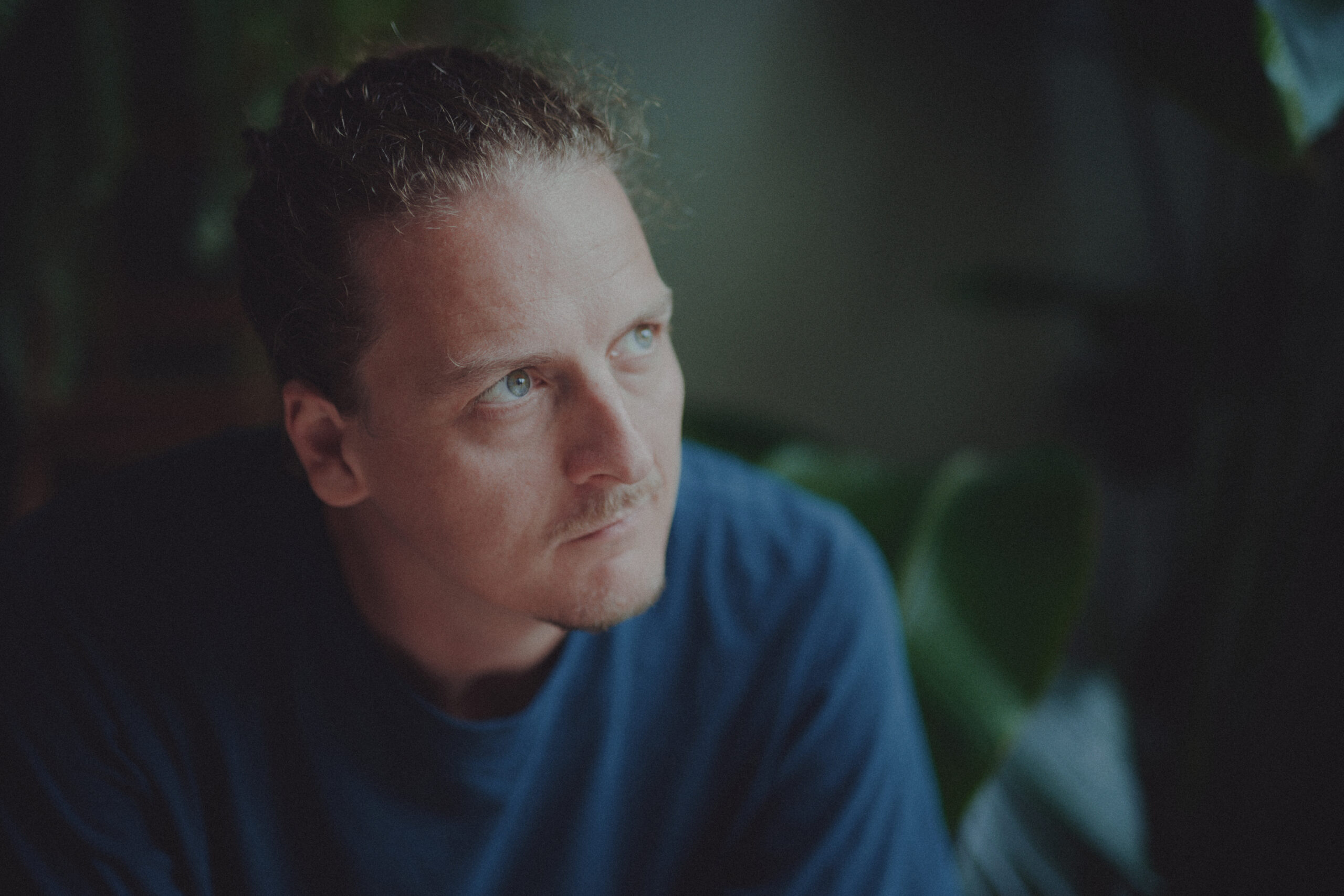
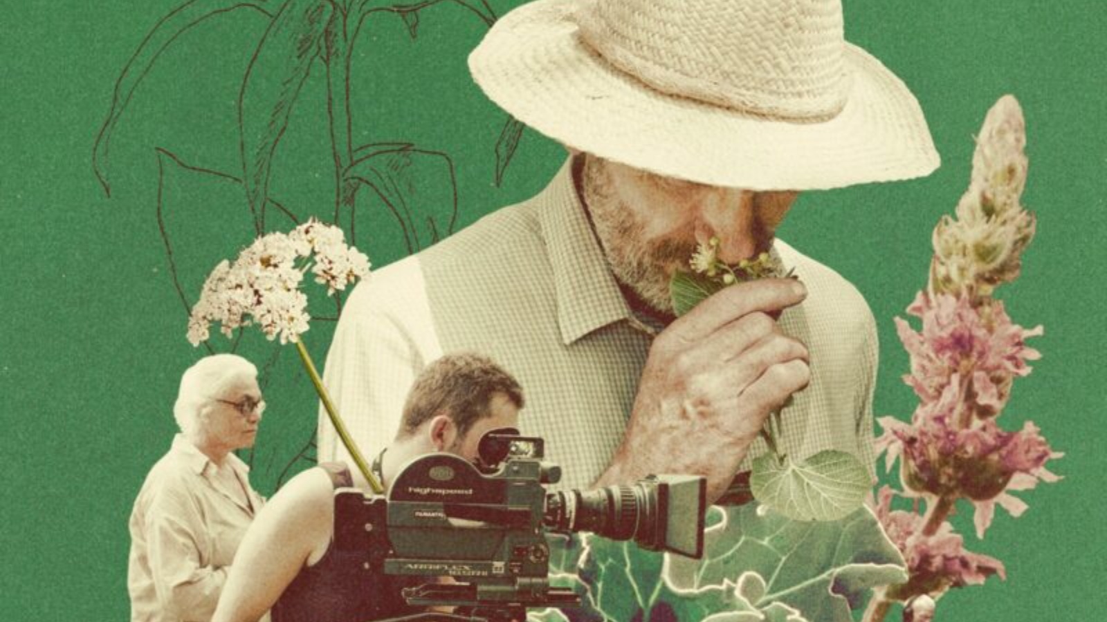
While there are no physical boxes on the French sheet for 7 Walks with Mark Brown (limited, June 20), the entire composition becomes a giant viewfinder zooming into a flower that’s being singled out by a human hand. It becomes our sole focal point despite all the other surrounding information––the bud Mark Brown is surely going to educate us on its etymology and scientific properties as he searches for the right species to populate a new “ancient garden.”
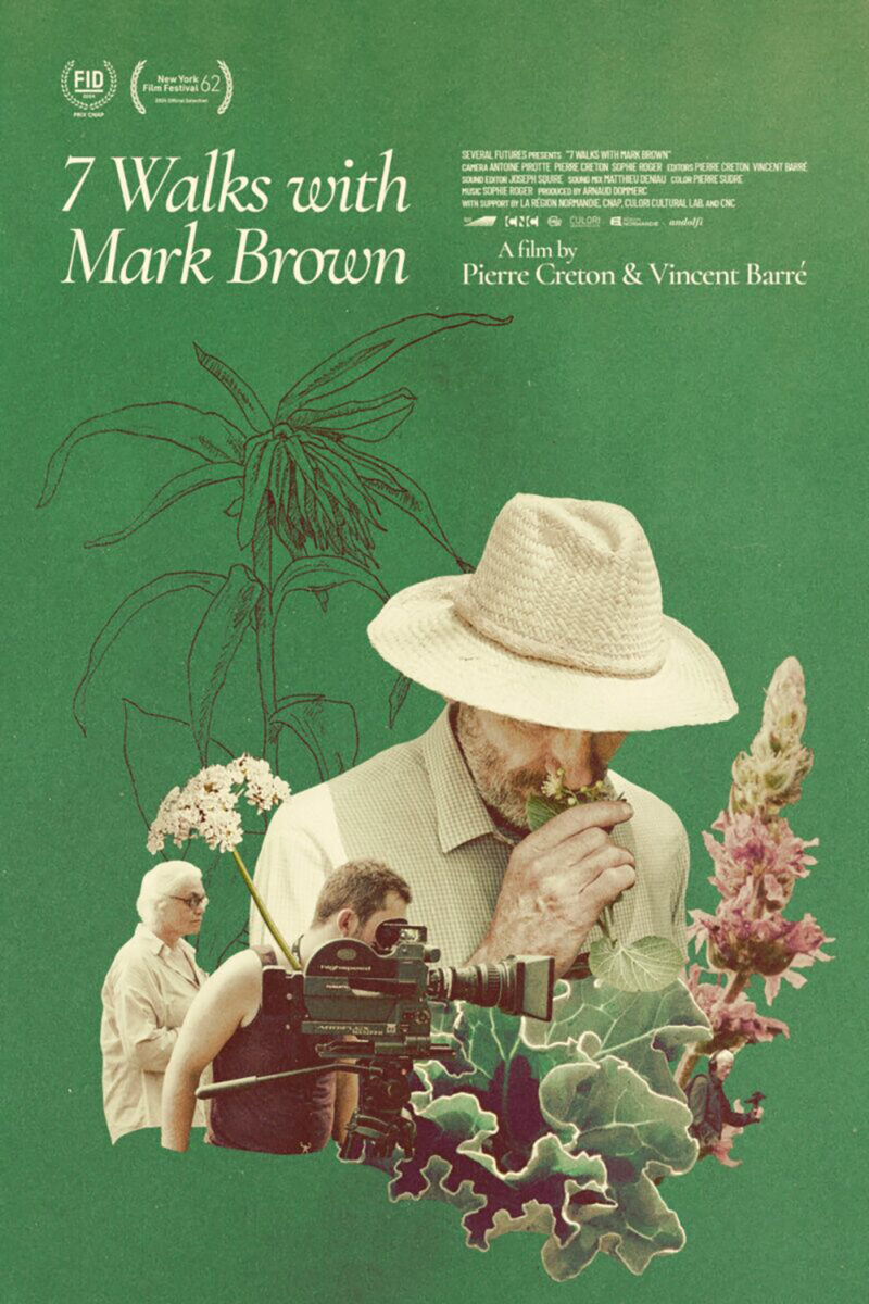
More than just the literal frame of the page also lies header and footer areas of white line drawings and text to further compress our gaze towards that red flourish of color in the center. It seems like a simple photograph with neatly stacked text, but everything about its execution leads us to a precise destination without any overt masking of the image. So we’re allowed a sense of freedom to roam, despite having no defense against where our vision ultimately wants to travel.
The American poster proves a stark contrast, but with equal success. It chooses to center Brown and the documentary crew following him above the plant life itself by constructing a collage of images balanced by a more compact and clean text block above. What intrigues me from the comparison is that the above appears simpler (perhaps cruder) in its aesthetic on first blush, but it’s this new version that actually strips down the visual language to a basic top-to-bottom, left-to-right read. The one that looks rudimentary guides us; the one that seems complex lets gravity do the work.
Afternoons of Solitude (limited, June 27) proves a case of “don’t fix what isn’t broken.” The Spanish poster was definitely not.
Its image captivates alone, with the portrait’s expressiveness and the paint streaks and drips covering it. This is a documentary about bullfighting; the sport’s emotional chaos is clearly represented through the rotation of the horizon line and the layered pigment hiding what’s beneath while also augmenting it.
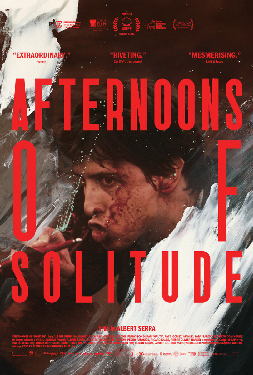
The real draw, though, is the typography. With two long words separated by a short one, the fully justified text forms a frame around the subject’s face to force us to look directly into their eyes. It’s not just the box itself, either. It’s also the coloring. The red of those compressed letters forms a solid blockade––especially when paired with the slab of red credits beneath. This is one obstruction upon another. Red frame over paint strokes over photograph over the reality of the image being captured. We are led through a journey from theater lobby to bullring.
And while the American one-sheet maintains the pieces (red text, boxed frame, image) it loses all impact. Part of that is in the translation: “Afternoons” and “Solitude” are longer than “Tardes” and “Soledad.” The difference spreads the box too far and the choice to increase the kerning ruins the solid-block effect of its predecessor even more. The most egregious alteration, though, is rotating the image back to normal. No longer are we in the action, twisted and turned with the chaos of the event. Now we’re merely gazing at a photo with text superimposed above it. Still pleasing to the eye, but much less intense.
The post Posterized June 2025: Afternoons of Solitude, 7 Walks with Mark Brown, Dangerous Animals & More first appeared on The Film Stage.