


![Watch: American Airlines Passengers Casually Walk Aisles During Taxi—Did Seatbelt Rules Just Disappear? [Roundup]](https://viewfromthewing.com/wp-content/uploads/2025/06/standing-in-aisle.jpg?#)


![This Switch 2 Accessory Is Making Fans Drop Their Consoles And The Manufacturer's Response Is Only Making Things Worse [Update: Everyone's Getting Free Upgraded Joy-Con Grips Following Death Threats]](https://i.kinja-img.com/image/upload/c_fill,h_675,pg_1,q_80,w_1200/d26954494c474d4929b602da22e51149.gif)


![[Podcast] Problem Framing: Rewire How You Think, Create, and Lead with Rory Sutherland](https://justcreative.com/wp-content/uploads/2025/06/rort-sutherland-35.png)


Can Good UX Protect Older Users From Digital Scams?
As online scams become more sophisticated, Carrie Webster explores whether good UX can serve as a frontline defense, particularly for non-tech-savvy older users navigating today’s digital world.

A few years ago, my mum, who is in her 80s and not tech-savvy, almost got scammed. She received an email from what appeared to be her bank. It looked convincing, with a professional logo, clean formatting, and no obvious typos. The message said there was a suspicious charge on her account and presented a link asking her to “verify immediately.”
She wasn’t sure what to do. So she called me.
That hesitation saved her. The email was fake, and if she’d clicked on the link, she would’ve landed on a counterfeit login page, handing over her password details without knowing it.
That incident shook me. I design digital experiences for a living. And yet, someone I love almost got caught simply because a bad actor knew how to design well. That raised a question I haven’t stopped thinking about since: Can good UX protect people from online scams?
Quite apart from this incident, I see my Mum struggle with most apps on her phone. For example, navigating around her WhatsApp and YouTube apps seems to be very awkward for her. She is not used to accessing the standard app navigation at the bottom of the screen. What’s “intuitive” for many users is simply not understood by older, non-tech users. Brief Overview Of How Scams Are Evolving Online
Online scams are becoming increasingly sophisticated, leveraging advanced technologies like artificial intelligence and deepfake videos to create more convincing yet fraudulent content. Scammers are also exploiting new digital platforms, including social media and messaging apps, to reach victims more directly and personally.
Phishing schemes have become more targeted, often using personal information taken from social media to craft customised attacks. Additionally, scammers are using crypto schemes and fake investment opportunities to lure those seeking quick financial gains, making online scams more convincing, diverse, and harder to detect. The Rise In Fraud Targeting Older, Less Tech-savvy Users
In 2021, there were more than 90,000 older victims of fraud, according to the FBI. These cases resulted in US$1.7 billion in losses, a 74% increase compared with 2020. Even so, that may be a significant undercount since embarrassment or lack of awareness keeps some victims from reporting.
In Australia, the ACCC’s 2023 “Targeting Scams” report revealed that Australians aged 65 and over were the only age group to experience an increase in scam losses compared to the previous year. Their losses rose by 13.3% to $120 million, often following contact with scammers on social media platforms.
In the UK, nearly three in five (61%) people aged over 65 have been the target of fraud or a scam. On average, older people who have been scammed have lost nearly £4,000 each.
According to global consumer protection agencies, people over 60 are more likely to lose money to online scams than any other group. That’s a glaring sign: we need to rethink how we’re designing experiences for them.
Older users are disproportionately targeted by scammers for several reasons:
- They’re perceived as having more savings or assets.
- They’re less likely to be digital natives, so they may not spot the red flags others do.
- They tend to trust authority figures and brands, especially when messages appear “official.”
Scammers exploit trust. They impersonate banks, government agencies, health providers, and even family members. The one that scares me the most is the ability to use AI to mimic a loved one’s voice — anyone can be tricked by this. Cognitive Load And Decision Fatigue In Older Users
Imagine navigating a confusing mobile app after a long day. Now imagine you’re in your 70s or 80s; your eyesight isn’t as sharp, your finger tapping isn’t as accurate, and every new screen feels like a puzzle.
As people age, they may experience slower processing speeds, reduced working memory, and lower tolerance for complexity. That means:
- Multistep processes are harder to follow.
- Unexpected changes in layout or behaviour can cause anxiety.
- Vague language increases confusion.
Decision fatigue hits harder, too. If a user has already made five choices on an app, they may click the 6th button without fully understanding what it does, especially if it seems to be part of the flow.
Scammers rely on these factors. However, good UX can help to reduce it. The Digital Literacy Gap And Common Pain Points
There’s a big difference between someone who grew up with the internet and someone who started using it in their 60s. Older users often struggle with:
- Recognising safe vs. suspicious links;
- Differentiating between ads and actual content;
- Knowing how to verify sources;
- Understanding terms like “multi-factor authentication” or “phishing”.
They may also be more likely to blame themselves when something goes wrong, leading to underreporting and repeat victimization.
Design can help to bridge some of that gap. But only if we build with their experience in mind. The Role UX Designers Can Play In Preventing Harm
As UX designers, we focus on making things easy, intuitive, and accessible. But we can also shape how people understand risk.
Every choice, from wording to layout to colour, can affect how users interpret safety cues. When we design for the right cues, we help users avoid mistakes. When we get them wrong or ignore them altogether, we leave people vulnerable.
The good news? We have tools. We have influence. And in a world where digital scams are rising, we can use both to design for protection, not just productivity. UX As The First Line Of Defence
The list below describes some UX design improvements that we can consider as designers:
1. Clear, Simple Design As A Defence Mechanism
- Simple interfaces reduce user errors and scam risks.
- Use linear flows, fewer input fields, and clear, consistent instructions.
- Helps users feel confident and spot unusual activity.
2. Make Security Cues Obvious And Consistent
- Users rely on visible indicators: padlocks, HTTPS, and verification badges.
![]()
- Provide clear warnings for risky actions and unambiguous button labels.
3. Prioritize Clarity In Language
- Use plain, direct language for critical actions (e.g., “Confirm $400 transfer”).
- Avoid vague CTAs like “Continue” or playful labels like “Let’s go!”
- Clear language reduces uncertainty, especially for older users.

4. Focus On Accessibility And Readability
- Use minimum 16px fonts and high-contrast colour schemes.
- Provide clear spacing and headings to improve scanning.
- Accessibility benefits everyone, not just older users.
![]()
5. Use Friction To Protect, Not Hinder
- Intentional friction (e.g., verification steps or warnings) can prevent mistakes.
- Thoughtfully applied, it enhances safety without frustrating users.
6. Embed Contextual Education
- Include just-in-time tips, tooltips, and passive alerts.
- Help users understand risks within the flow, not after the fact.
 What Can’t UX Fix?
Let’s be realistic: UX isn’t magic. We can’t stop phishing emails from landing in someone’s inbox. We can’t rewrite bad policies, and we can’t always prevent users from clicking on a well-disguised trap.
I personally think that even good UX may be limited in helping people like my mother, who will never be tech-savvy. To help those like her, ultimately, additional elements like support contact numbers, face-to-face courses on how to stay safe on your phone, and, of course, help from family members as required. These are all about human contact touch points, which can never be replaced by any kind of digital or AI support that may be available.
What we can do as designers is build systems that make hesitation feel natural. We can provide visual clarity, reduce ambiguity, and inject small moments of friction that nudge users to double-check before proceeding, especially in financial and banking apps and websites.
That hesitation might be the safeguard we need. Other Key Tips To Help Seniors Avoid Online Scams
1. Be Skeptical Of Unsolicited Communications
Scammers often pose as trusted entities like banks, government agencies, or tech support to trick individuals into revealing personal information. Avoid clicking on links or downloading attachments from unknown sources, and never share personal details like your Medicare number, passwords, or banking information unless you’ve verified the request independently.
2. Use Strong, Unique Passwords And Enable Two-Factor Authentication
Create complex passwords that combine letters, numbers, and symbols, and avoid reusing passwords across different accounts. Whenever possible, enable two-factor authentication (2FA) to add an extra layer of security to your online accounts.
3. Stay Informed About Common Scams
Educate yourself on prevalent scams targeting seniors, such as phishing emails, romance scams, tech support fraud, and investment schemes. Regularly consult trusted resources like the NCOA and Age UK for updates on new scam tactics and prevention strategies.
4. Verify Before You Act
If you receive a request for money or personal information, especially if it's urgent, take a moment to verify its legitimacy. Contact the organization directly using official contact information, not the details provided in the suspicious message. Be particularly cautious with unexpected requests from supposed family members or friends.
5. Report Suspected Scams Promptly
If you believe you've encountered a scam, report it to the appropriate authorities. Reporting helps protect others and contributes to broader efforts to combat fraud.
For more comprehensive information and resources, consider exploring the following:
- National Council on Aging: 22 Tips for Seniors to Avoid Scams
- Age UK: Avoiding Scams Information Guide
- eSafety Commissioner: Online Scams for Seniors
I recall my mother not recognising a transaction in her banking app, and she thought that money was being taken from her account. It turns out that it was a legitimate transaction made in a local cafe, but the head office was located in a suburb she was not familiar with, which caused her to think it was fraudulent.
This kind of scenario could easily be addressed with a feature I have seen in the ING banking app (International Netherlands Group). You tap on the transaction to view more information about your transaction.
- ING bank: You can now select a transaction to get more information on the business.
 ING Banking App: click on the transaction to view more details. (Source: ING Help Hub)
- Banking apps like NAB (National Australia Bank) now interrupt suspicious transfers with messages like, “Have you spoken to this person on the phone? Scammers often pose as trusted contacts.” NAB said that December was the biggest month in 2024 for abandoned payments, with customers scrapping $26 million worth of payments after receiving a payment alert.
- Macquarie Bank has introduced additional prompts for bank transactions to confirm the user’s approval of all transactions.
![]()
- Monzo Bank has added three security elements to reduce online fraud for banking transactions:
- Verified Locations: Sending or moving large amounts of money from locations that the account holder has marked as safe. This helps block fraudsters from accessing funds if they’re not near these trusted places.
- Trusted Approvers: For large transactions, a trusted contact must give the green light. This adds protection if their phone is stolen or if they want to safeguard someone who may be more vulnerable.
- Secure QR Codes: Account holders can generate a special QR code and keep it stored in a safe place. They scan it when needed to unlock extra layers of security.
![]()
- Email platforms like Gmail highlight spoofed addresses or impersonation attempts with yellow banners and caution icons.

These interventions are not aimed at stopping users, but they can give them one last chance to rethink their transactions. That’s powerful.
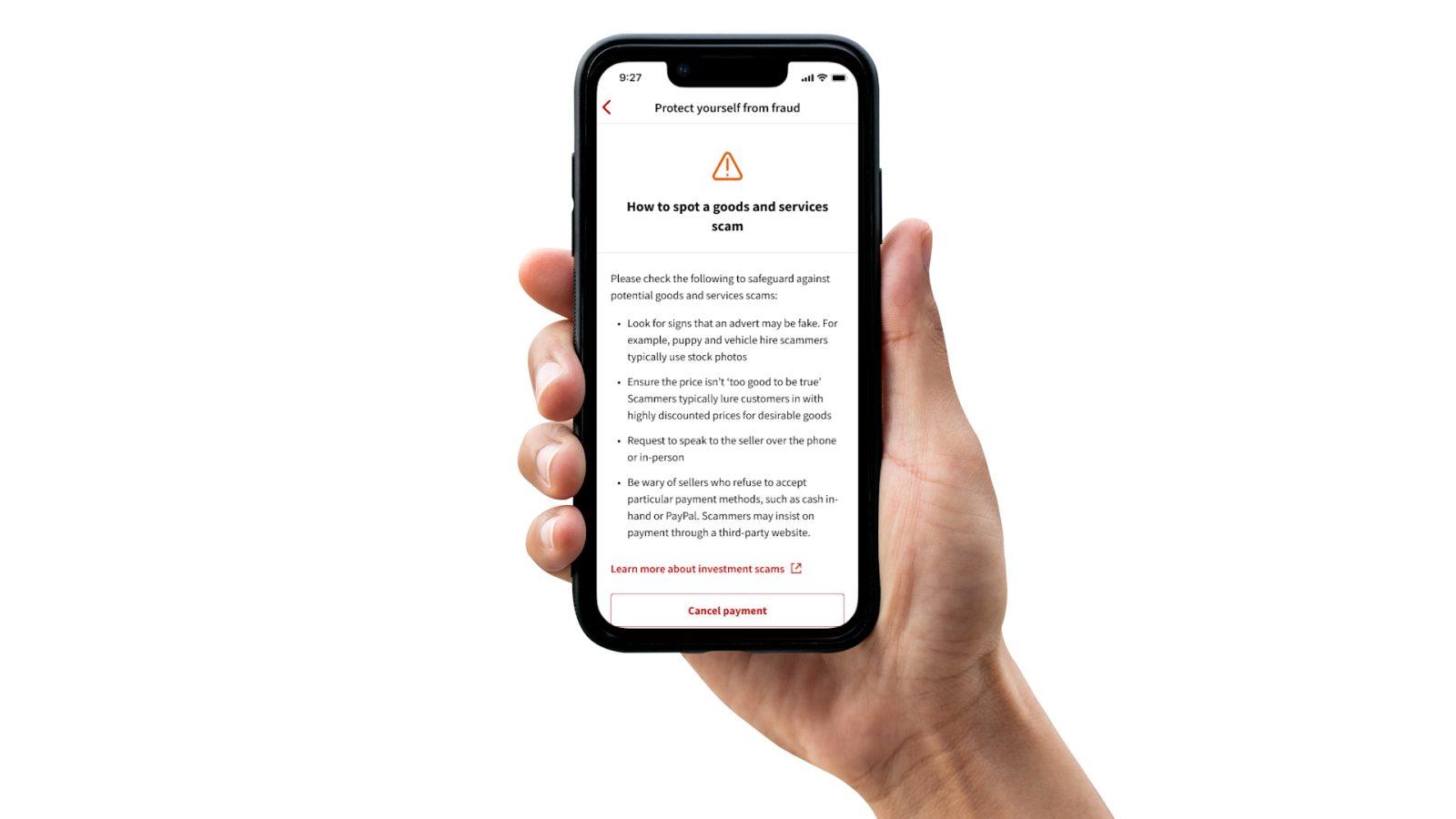
Finally, here’s an example of clear UX cues that streamline the experience and guide users through their journey with greater confidence and clarity.
 Conclusion
Added security features in banking apps, like the examples above, aren’t just about preventing fraud; they’re examples of thoughtful UX design. These features are built to feel natural, not burdensome, helping users stay safe without getting overwhelmed. As UX professionals, we have a responsibility to design with protection in mind, anticipating threats and creating experiences that guide users away from risky actions. Good UX in financial products isn’t just seamless; it’s about security by design.
And in a world where digital deception is on the rise, protection is usability. Designers have the power and the responsibility to make interfaces that support safer choices, especially for older users, whose lives and life savings may depend on a single click.
Let’s stop thinking of security as a backend concern or someone else’s job. Let’s design systems that are scam-resistant, age-inclusive, and intentionally clear. And don’t forget to reach out with the additional human touch to help your older family members.
When it comes down to it, good UX isn’t just helpful — it can be life-changing.


